Summary:
What is explored in the lecture
- What is data visualisation?
- Why we need it
- What data is
- The difference between data visualisation and an infographic
- Basic understanding of what a data visualiser does
Data Visualisation is a mass medium. It is an essential part in the communication process. The amount of data grows exponentially with a 23 Exabytes per seven days.
As Individuals, we create a lot of data:
- Social media Footprint (e.g. Facebook, Instagram)
- Smart phones
- Credit cards and purchases
- Travel
Designers engage with the:
- Aesthetics
- Forms
- Politics of data presentation
What is data?
Data are a measurement of values or quantitative variables belonging to a set of items. They can be viewed in graphs and images. Data, information and knowledge are overlapping concepts.
The process to present the data is:
- Data (Research)
- Information (Presentation)
- Knowledge (Conversation- Experience)
- Wisdom (Interpretation)
What is Data Visualisation?
“The visualisation of data.”
The goal is to communicate information clearly and efficiently through:
- Statistical graphics
- Plots
- Information graphics
Information Graphics vs. Data Visualisation
- Not all information visualisations are based on data, but all data visualisations are information data (For e.g. information visualisations may show a process/step)
- Needs to have proper measurements of an x/y axis. Better data information displays titles such as location an age.
Effective visualisation helps:
- Analyse and reason the data and evidence
- Complex data is accessible, understandable and usable
Users may have analytical tasks such as:
- Comparisons
- Understanding causality
Focus on:
- Right visualisation type or things you want to visualise
- Wrangling data to use
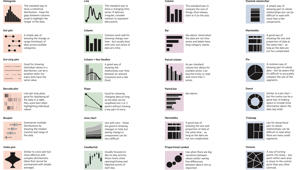
If there are two variables, a bar graph offers a simple yet effective design.
If the data is over time, a line graph or a timeline would be effective.
Perks: audience knows these graphs well
Over the next few weeks these aspects will be learnt:
- Standard and non-standard data vs time and how to use it
- Collecting data
- Organising said data
- Telling a story with the said data
Reflection:
The lecture pod explores data visualisation and why it is essential. It is important that we can convey a mass of information in a way that is comprehensible and accurate. This can be done with graphs and charts. It provides an opportunity for comparisons for this such as causality, rates and trends.
