*Click bold text to view websites.
Style Guide Presentation: When creating data visualisations, it is imperative that the designs remain consistent amongst multiple visualisations such as a series of infographics. This website explores an example style guide and shows ways to segregate data to ensure a cohesive design. For e.g. It explores the specifications required for a column graph regarding; text, colour, size, and layout.
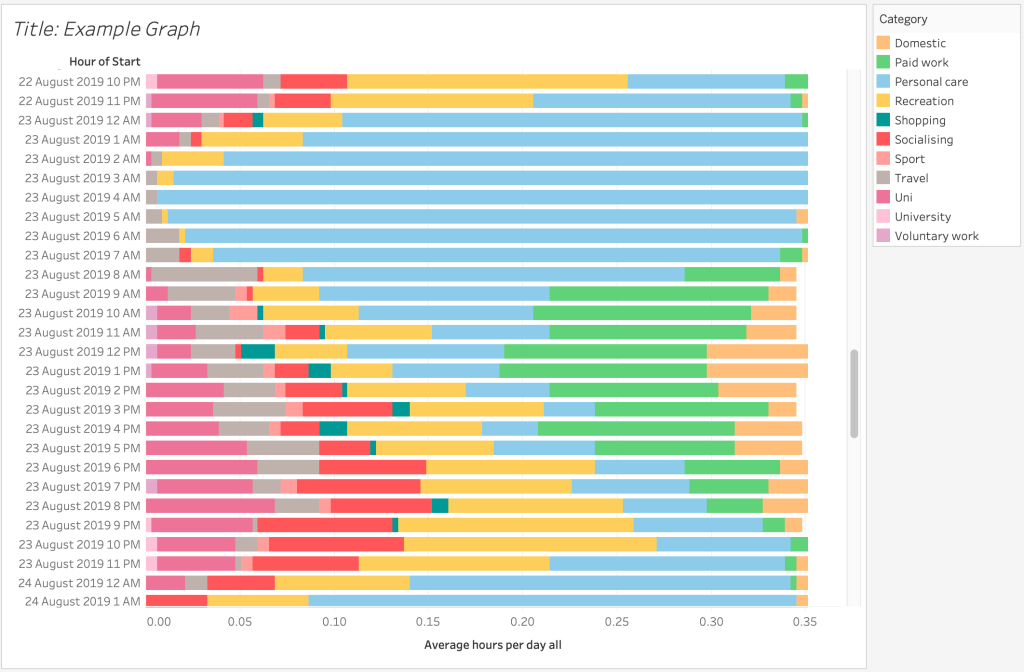
Tableau: This website explores the beginners guide to data visualisation through, definitions, examples and learning resources. This is also beneficial in it’s software as it allowed a variation of graphs to be made such as; column graphs, gannt charts, and cloropleth maps.
Design Examples: It is often good to look at precendent works to gain inspiration and to analyse the aspects that work well or need improvement. This website shows 25 excellent examples of a mixture of static and interactive designs.
Information is Beautiful: The lecture pods that were watched in the process has explored how designers have presented their data. This blog site is run bu David McCandless who was also also featured in the week 7 lecture pod. It shows a wide variety of data visualisations created, that have utilised, colour, graphics and text to create intricate designs.
The Effective Use of Graphs: Sometime, people are skeptical in which data can be presented. This online article explores the benefits of using graphs to effectively convey a complex, mass of data. It also explains what is being measure (For e.g. x-axis = time, y-axis = growth)