Summary
Why do we use graphs?
- To make comparisons easier
- Overuse of bubble charts
- Users are accustomed to compare heights or widths (not areas)
- Circles are more complicated than squares
- Using circles are harder to make accurate comparisons
- Using circles lead us to always underestimate the size difference

This graph shows that without the annotation of the percentage, it is difficult to determine the measurement.
Graphic Approaches to compare
Example 1: Alberto Cairo: The functional art scale
- The more accurate allows an easier judgement for readers to make = a more correct perception
- Shading and colour saturation to make relevant comparison (To help aid viewers)
- Dollar values need to be accurate hence why length-based graphs need to be used.
- Make sure readers make accurate comparisons
Common Graphs:
- Time Series Chart:
- Plots change over time
- E.g. stock market movement/ currency
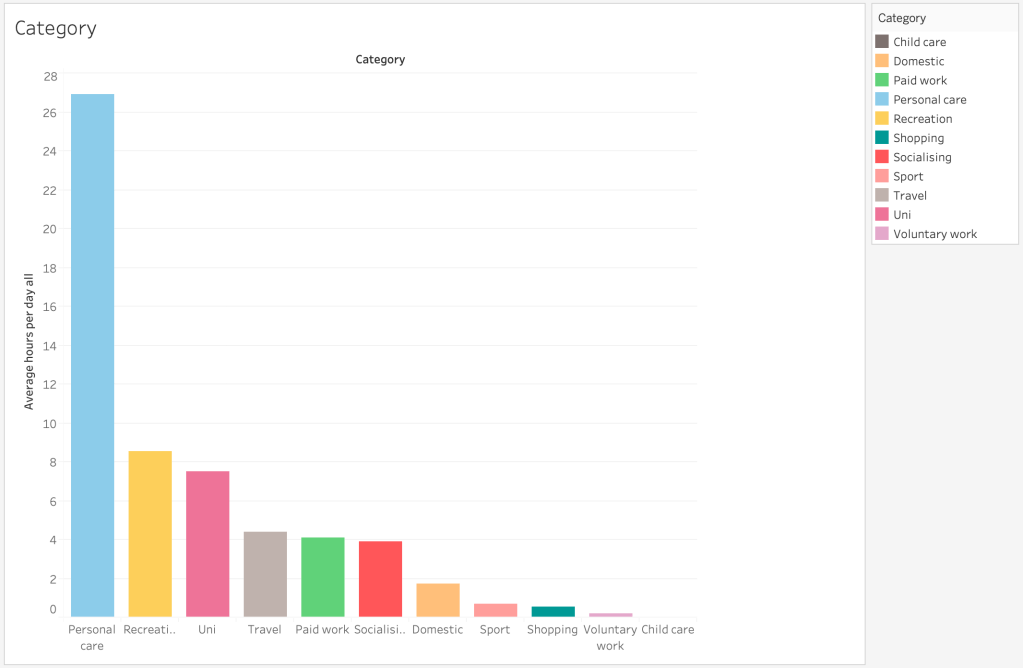
- Bar Chart
- Comparisons between things
- One dimensional
- Scatter plot
- Variable on each axis
- Compare things with multiple variables
Types of Charts:
Bar Charts:
- Useful
- Easy to use
- Most people are familiar with it
- Quick to compare information
- Shows highs and lows at a glance
- Effective with numerical data
Line Chart:
- Popular
- Frequently used
- Connect individual numeric data points (sequence of values)
- Shows trends in data over time
- Time sequence over data (change over time)
Pie Chart:
- Commonly used (and badly used)
- Show relative proportions/percentages
- Should be used only for above reasons
- Limit to SIX wedges
Reflection
The most important aspect of this lecture was learning that we as humans comprehend heights and widths better than surface area. This is why when we compare bubble graphs, the comparison is not as obvious than when using a column graph or bar graph. It is beneficial to know this as I now know how to efficiently display graphs.
