Summary
Historical things and contemporary developments
Visualisations:
- Used to help enable audience to understand large amounts of data
- E.g. war and death
- Can reduce the time it takes to understand the events, especially with complex data
- Gives audience tools to analyse and compare
- Shows variables in data
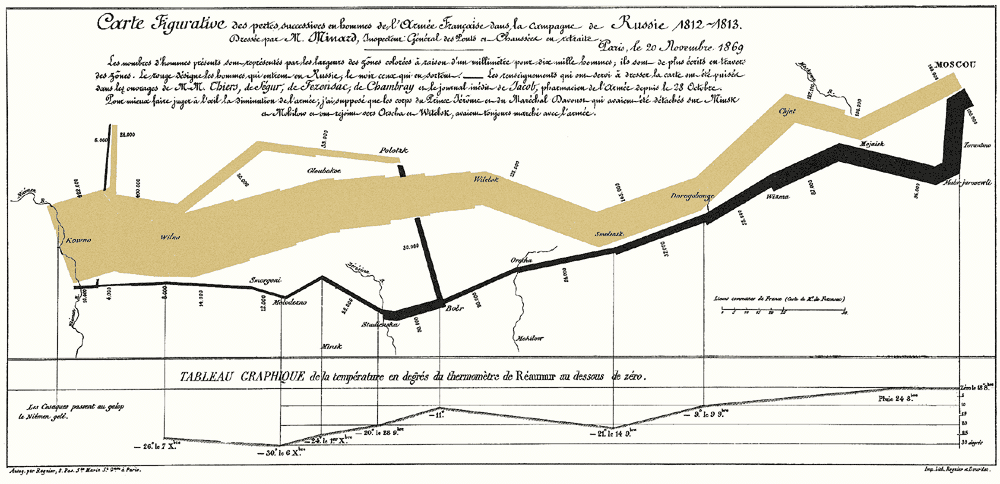
Example 1: Napoleon’s Invasion of Russia Graph
- Variables: strength of army
- Brown lines depicts army going to Moscow
- Darker line shows army returns to west
- The thickness of the line represents the amount of people alive in the army
- The second graph underneath shows temperature
Example 2: Florence Nightingale’s Graphs
- Graph exposes the cause of death and death rates amongst the soldiers
- Wedge layout allows the small data to be viewed in the centre
- Allows to view the casualty over time, wedge allows for easier view

Otto Neurath:
- “Educating through the eye”
- ISOTYPE: International System of Typographic Picture Education – serialisation of images
- Using one figure to represent greater quantity
- Industrial approach – Believed they should bring the museum to the people. Multiple versions created to be shipped and displayed
- Vertical access of major parties makes it easier to compare
- Aims to transform society into well informed citizens
Reflection
This lecture explored examples of past successful graphs; Napoleon’s invasion of Russia and Florence Nightingale’s graph. The graph of Napoleon’s invasion is fairly complex with multiple variables such as; time, location, weather and army size. The way in which this graph has been presented is fairly successful as it depicts a clear story with an accurate representation of the data.
